How we redesigned Tandem in 2 weeks
By
Tandem Health
·
·
Product update

At Tandem, one of our core values is Speed to Impact, which drives us to focus on what truly makes a difference and to execute quickly. An example of this in action was during our recent redesign.
When Tandem first started, the primary focus was getting our solution if front of users as fast as possible. This allowed us to quickly get input from clinicians and start scaling - but as a result, design was a secondary priority for a while.
To ensure a consistent experience for large volumes to be onboarded after summer, if we were going to redesign Tandem - we needed to do it before summer ended. Given our tight timeline—taking development and testing into account—we had around two weeks to allocate to the redesign.
The redesign served multiple purposes:
Updating the visual design to align with our new brand identity
Incorporating insights we had collected from working with hundreds of users across medical specialties on key functionality and usability aspects
Future proofing our design - so it allows us to easily add new features from our product roadmap into the interface as we continue to grow Tandem
To meet our timeline, without compromising on quality, we followed a set of principles throughout:
1. Strict prioritization
With only two weeks to work with, strict prioritization was crucial. While it was tempting to for example start by building a proper design system, we repeatedly asked ourselves: “Will this bring significant value to our users today?”. And by only focusing on immediate value, we could make conscious decisions about what we need to tackle now and what could wait.

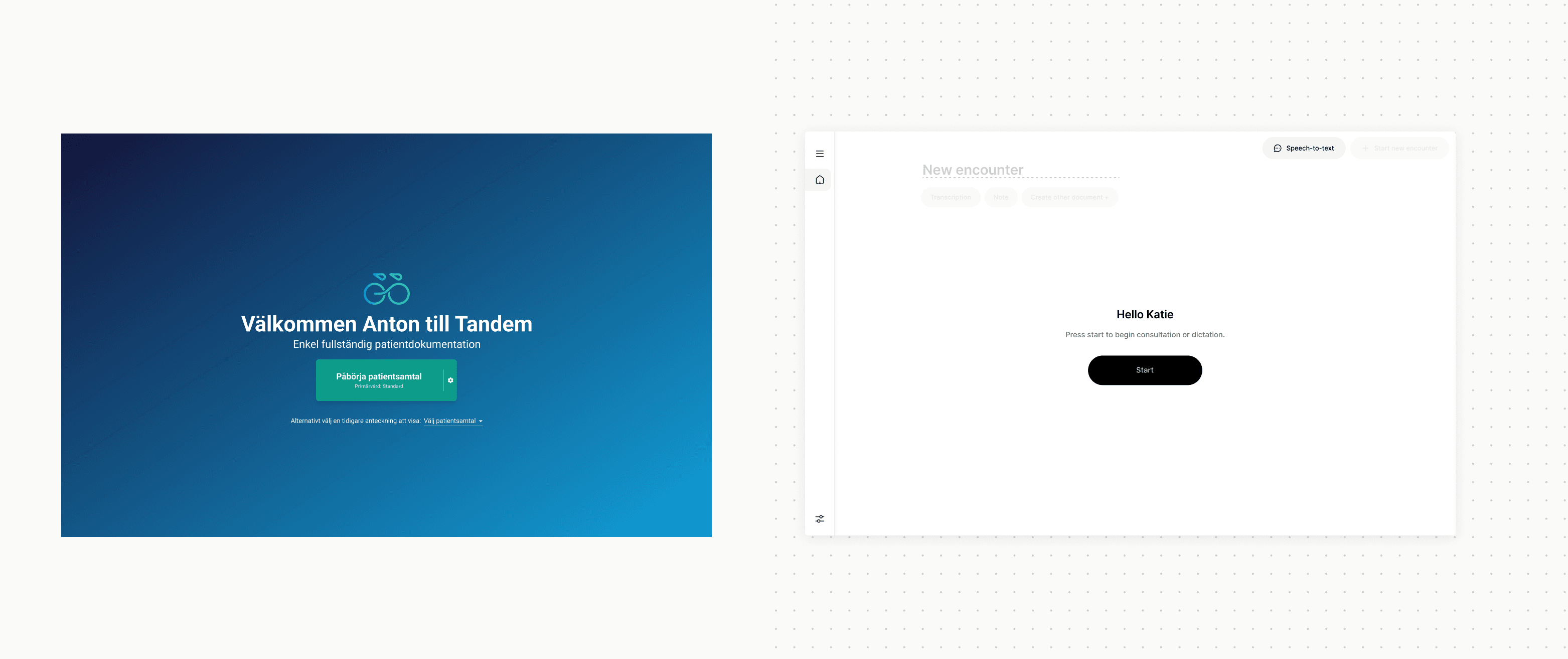
We leaned into the things we've discovered makes Tandem great — like our intuitive and clear call-to-actions
2. Quick iteration with users
Another way we maintained speed was by closely collaborating with users that wanted to contribute to improving the product. This ensured that, at any given time, we had direct access to real users to capture feedback.
As mentioned, we also had the advantage of our deep relationship with users over time, which had already given us an internal knowledge base on what their key pain points and most wanted features were. This allowed us to hit the ground running.
Both of these points enabled us to quickly iterate on design ideas, validate them, and identify potential usability issues early on.

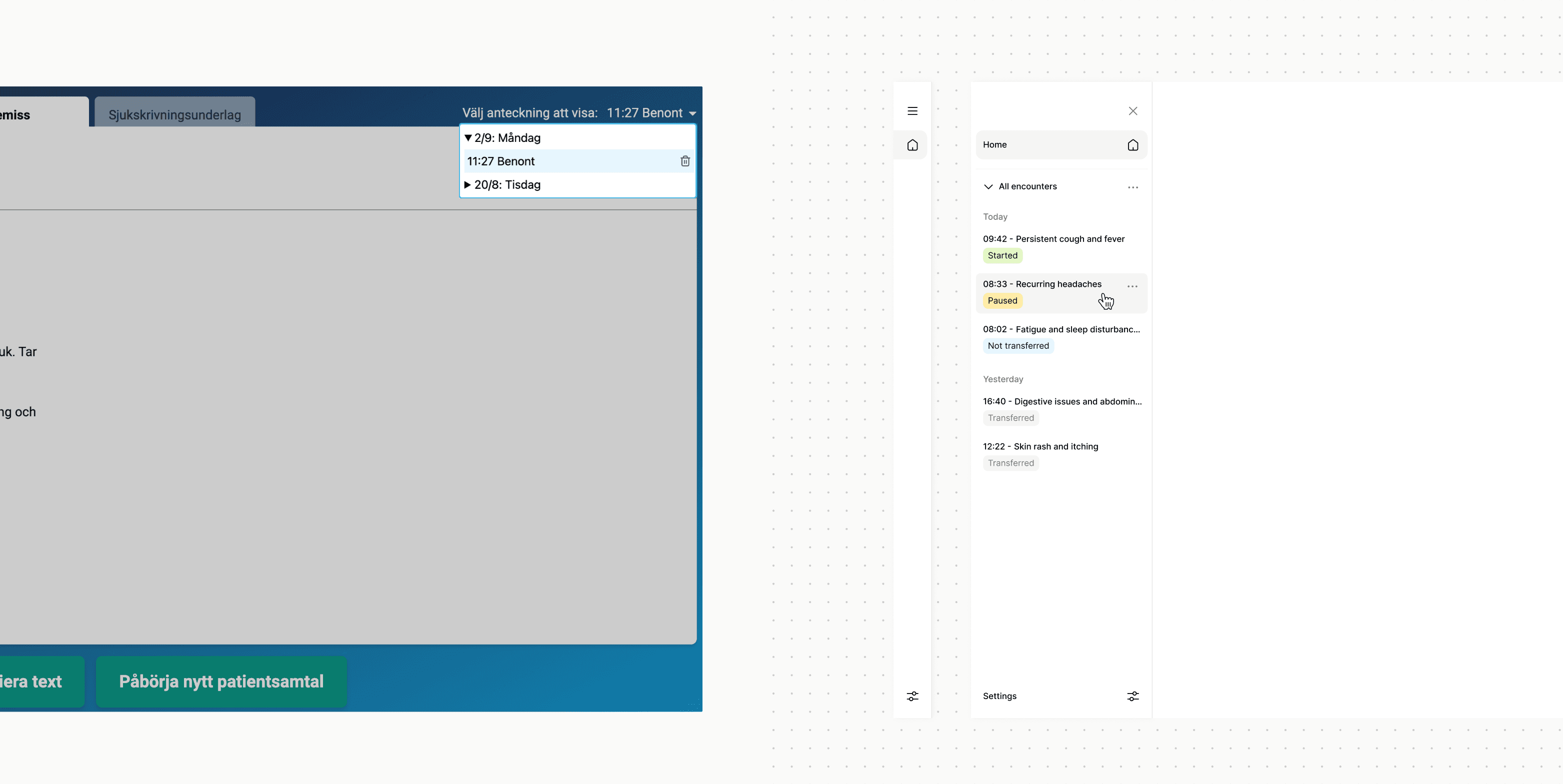
Improved navigation and new features like seeing the status of your patient encounters
3. Launch-and-learn mindset
One of the big advantages of working on a digital product is the ability to launch, learn and improve. At Tandem, we take advantage of this flexibility, so instead of overthinking or second-guessing, we are quick to launch to get our features out there and evaluate them in the real world. This helps us move quickly and gather valuable live data from actual usage. Which means that for every new launch, we’re better equipped to make informed decisions and adapt our designs based on real user feedback.

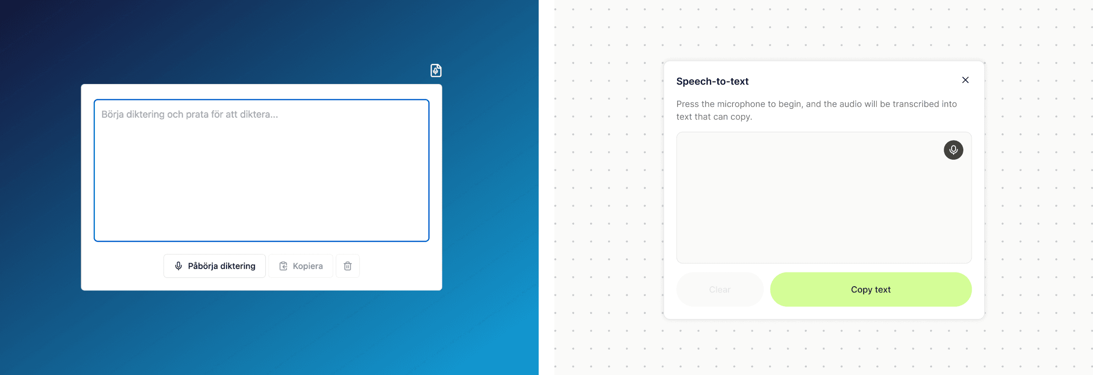
Visual updates to align with brand and improved usability of existing features
At Tandem, redesigning our entire product in just two weeks isn’t our usual pace. However, it demonstrates what’s possible when a team unites around a clear goal, works collaboratively, and engages with users throughout the process. You can work fast, as long as you also work smart—prioritizing what truly matters, staying collaborative, and embracing user feedback along the way.
Are you interested in joining our mission? Check out our open roles and become part of a team.

Anton Nyström
Lead Product Designer at Tandem Health


