Brand
Colours








Brand
Colours
Primary palette
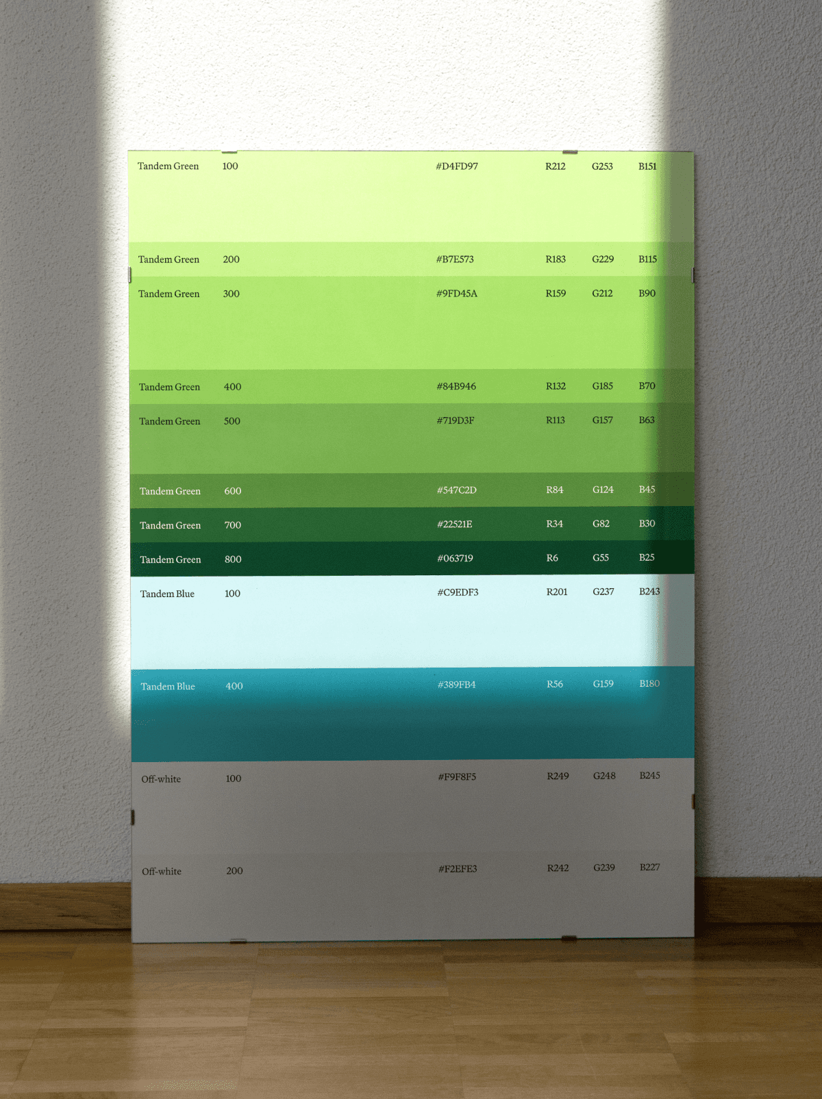
At Tandem we're a green brand. The signature green is the one thing people should remember, so it shows up as a single confident moment, never spread across the page. The other greens support it, and the blues sit quietly behind, used only now and then. If green is everywhere, it stops meaning anything.
Tandem Green
#BFF66F
CMYK 22/0/55/4
PMS 374 C
Green 500
#63A504
CMYK 40/0/98/35
PMS 369 C
Blue 900
#08181B
CMYK 70/11/0/89
PMS 546 C
Green 100
#D4FD97
CMYK 16/0/40/1
PMS 373 C
Blue 100
#C9EDF3
CMYK 17/2/0/5
PMS 628 C
Green 300
#9FD45A
CMYK 25/0/58/17
PMS 367 C
Blue 400
#389FB4
CMYK 69/12/0/29
PMS 7702 C

Neutrals
This is the ground everything stands on. We're an off-white brand more than a stark-white one, warm rather than clinical, with white and near-black kept for where they earn their place. These are the most-used colours in almost anything we make.
Pure White
#FFFFFF
CMYK 0/0/0/0
PMS None (paper white)
Off-White
#F9F8F5
CMYK 0/0/2/2
PMS Cool Gray 1 C (approx)
Off-White 200
#F2EFE3
CMYK 0/1/6/5
PMS 7527 C (approx)
Pitch Black
#000000
CMYK 0/0/0/100
PMS Process Black C
Black Background
#0C0A09
CMYK 0/17/25/95
PMS Neutral Black C (approx)
Grayscale
Grey does the quiet work: backgrounds, lines, and most of the text. We reach for grey before any colour. Lean on neutrals and grey for nearly everything, and that restraint is exactly what makes the green land when it appears.
Gray 50
#FAFAF9
CMYK 0/0/0/2
PMS None (too light)
Gray 100
#F5F5F4
CMYK 0/0/0/4
PMS None (too light)
Gray 200
#E7E5E4
CMYK 0/1/1/9
PMS Cool Gray 1 C (approx)
Gray 300
#D5D3D1
CMYK 0/1/2/16
PMS Cool Gray 2 C
Gray 400
#A8A29D
CMYK 0/4/7/34
PMS Warm Gray 5 C
Gray 500
#78716C
CMYK 0/6/10/53
PMS Warm Gray 10 C
Gray 600
#57534F
CMYK 0/5/9/66
PMS 411 C (approx)
Gray 700
#44403C
CMYK 0/6/12/73
PMS Black 7 C
Gray 800
#292524
CMYK 0/10/12/84
PMS Black C
Gray 900
#1B1917
CMYK 0/7/15/89
PMS Neutral Black C

Primary palette
At Tandem we're a green brand. The signature green is the one thing people should remember, so it shows up as a single confident moment, never spread across the page. The other greens support it, and the blues sit quietly behind, used only now and then. If green is everywhere, it stops meaning anything.
Tandem Green
#BFF66F
CMYK 22/0/55/4
PMS 374 C
Green 100
#D4FD97
CMYK 16/0/40/1
PMS 373 C
Green 300
#9FD45A
CMYK 25/0/58/17
PMS 367 C
Green 500
#63A504
CMYK 40/0/98/35
PMS 369 C
Blue 100
#C9EDF3
CMYK 17/2/0/5
PMS 628 C
Blue 400
#389FB4
CMYK 69/12/0/29
PMS 7702 C
Blue 900
#08181B
CMYK 70/11/0/89
PMS 546 C
Neutrals
This is the ground everything stands on. We're an off-white brand more than a stark-white one, warm rather than clinical, with white and near-black kept for where they earn their place. These are the most-used colours in almost anything we make.
Pure White
#FFFFFF
CMYK 0/0/0/0
PMS None (paper white)
Off-White
#F9F8F5
CMYK 0/0/2/2
PMS Cool Gray 1 C (approx)
Off-White 200
#F2EFE3
CMYK 0/1/6/5
PMS 7527 C (approx)
Pitch Black
#000000
CMYK 0/0/0/100
PMS Process Black C
Black Background
#0C0A09
CMYK 0/17/25/95
PMS Neutral Black C (approx)
Grayscale
Grey does the quiet work: backgrounds, lines, and most of the text. We reach for grey before any colour. Lean on neutrals and grey for nearly everything, and that restraint is exactly what makes the green land when it appears.
Gray 50
#FAFAF9
CMYK 0/0/0/2
PMS None (too light)
Gray 100
#F5F5F4
CMYK 0/0/0/4
PMS None (too light)
Gray 200
#E7E5E4
CMYK 0/1/1/9
PMS Cool Gray 1 C (approx)
Gray 300
#D5D3D1
CMYK 0/1/2/16
PMS Cool Gray 2 C
Gray 400
#A8A29D
CMYK 0/4/7/34
PMS Warm Gray 5 C
Gray 500
#78716C
CMYK 0/6/10/53
PMS Warm Gray 10 C
Gray 600
#57534F
CMYK 0/5/9/66
PMS 411 C (approx)
Gray 700
#44403C
CMYK 0/6/12/73
PMS Black 7 C
Gray 800
#292524
CMYK 0/10/12/84
PMS Black C
Gray 900
#1B1917
CMYK 0/7/15/89
PMS Neutral Black C