Brand
Layout








Brand
Layout
Print layouts
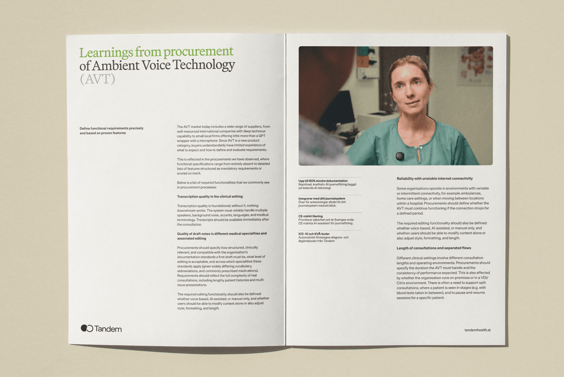
Print carries a single thought, and it should carry it plainly. No decoration, no crowding, no line doing more work than it needs to. A statement stands alone on the page, earns the space around it, and trusts the reader to sit with it. This is not where Tandem explains itself. It is where Tandem shows what it already knows to be true.
" width="13.999999693960666px"><path d="M 0 7.677 C 0.61 8.493 1.544 9.003 2.56 9.076 C 3.576 9.149 4.573 8.777 5.293 8.056 L 7.399 5.95 C 8.729 4.572 8.71 2.382 7.356 1.028 C 6.002 -0.326 3.813 -0.345 2.436 0.986 L 1.228 2.186" fill="transparent" height="9.084931049789459px" id="V2FGrO58o" stroke-dasharray="" stroke-linecap="round" stroke-linejoin="round" stroke-width="1.5" stroke="rgb(0, 0, 0)" transform="translate(5.616 0)" width="8.384152106375218px"/><path d="M 8.384 1.408 C 7.774 0.592 6.84 0.082 5.824 0.009 C 4.808 -0.064 3.811 0.308 3.091 1.029 L 0.985 3.135 C -0.345 4.513 -0.326 6.702 1.028 8.057 C 2.382 9.411 4.571 9.43 5.948 8.099 L 7.149 6.899" fill="transparent" height="9.08493104978948px" id="gbgD57Ytr" stroke-dasharray="" stroke-linecap="round" stroke-linejoin="round" stroke-width="1.5" stroke="rgb(0, 0, 0)" transform="translate(0 4.915)" width="8.384152106375495px"/></g></svg>)
Access is open to all Tandem employees by default; for external access, email brand@tandemhealth.ai.

Packaging
Inside is what clinicians actually need, nothing more. No claims dressed up as features. What you'll find here has been tested where care happens, not in a demo. Assembled with the same standard we hold for everything we build: proof, not promise.


The QR code
We get real discomfort from QR codes, so we treat them with care. If one is absolutely necessary, it needs to look the part: quiet, considered, and built for the page it sits on. The link behind it stays simple too, a redirect set up so it isn't cluttered with UTM tags.


Print layouts
Print carries a single thought, and it should carry it plainly. No decoration, no crowding, no line doing more work than it needs to. A statement stands alone on the page, earns the space around it, and trusts the reader to sit with it. This is not where Tandem explains itself. It is where Tandem shows what it already knows to be true.
Access is open to all Tandem employees by default; for external access, email brand@tandemhealth.ai.
Packaging
Inside is what clinicians actually need, nothing more. No claims dressed up as features. What you'll find here has been tested where care happens, not in a demo. Assembled with the same standard we hold for everything we build: proof, not promise.
The QR code
We get real discomfort from QR codes, so we treat them with care. If one is absolutely necessary, it needs to look the part: quiet, considered, and built for the page it sits on. The link behind it stays simple too, a redirect set up so it isn't cluttered with UTM tags.