Brand
Trademarks








Brand
Trademarks
Primary mark
How to use
For almost all applications, we use the main mark: a black or white logo placed over a solid background or on brand imagery. The logo should maintain a minimum margin equal to the width of the icon from all edges. Do not use a version that's stacked. One consistent logo is enough and supports stronger brand recognition.






Secondary mark
How to use
Secondary marks may be used only when the primary mark is too large for a given application. These instances are rare. Their primary role is to act as an icon in its own right, clean and centered on a page or used as a mask. The only regular exception is in social icons, where the secondary mark is acceptable.





Partnerships
Layouted
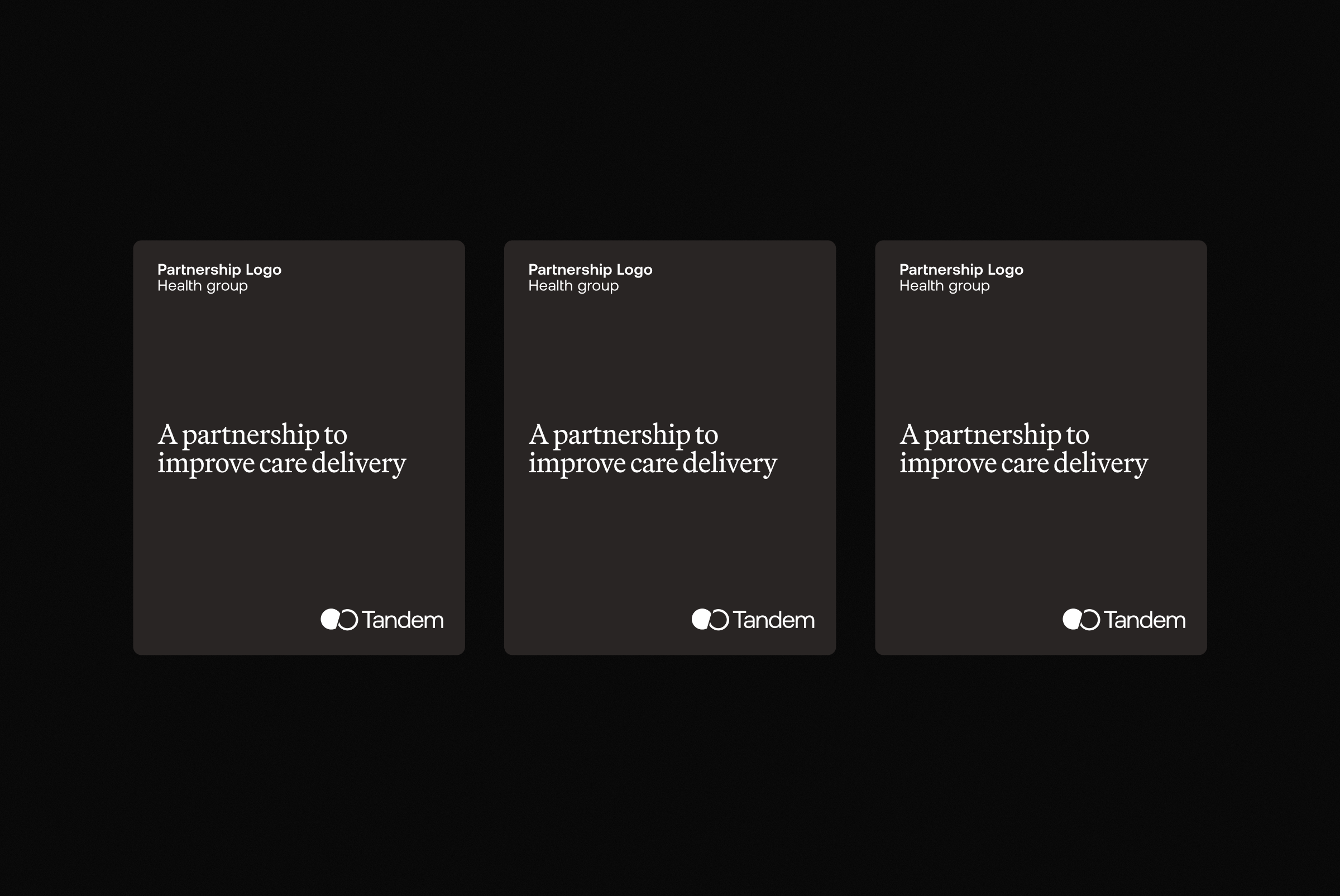
The two logos sit in opposite corners, equal in weight. Neither leads, because a partnership is two organisations doing real work together. Behind them sits a real moment of care: a consultation in progress, Tandem working quietly in the background where it belongs. The clinician and patient hold the frame. They are the subject, never the software.
Logo mashup
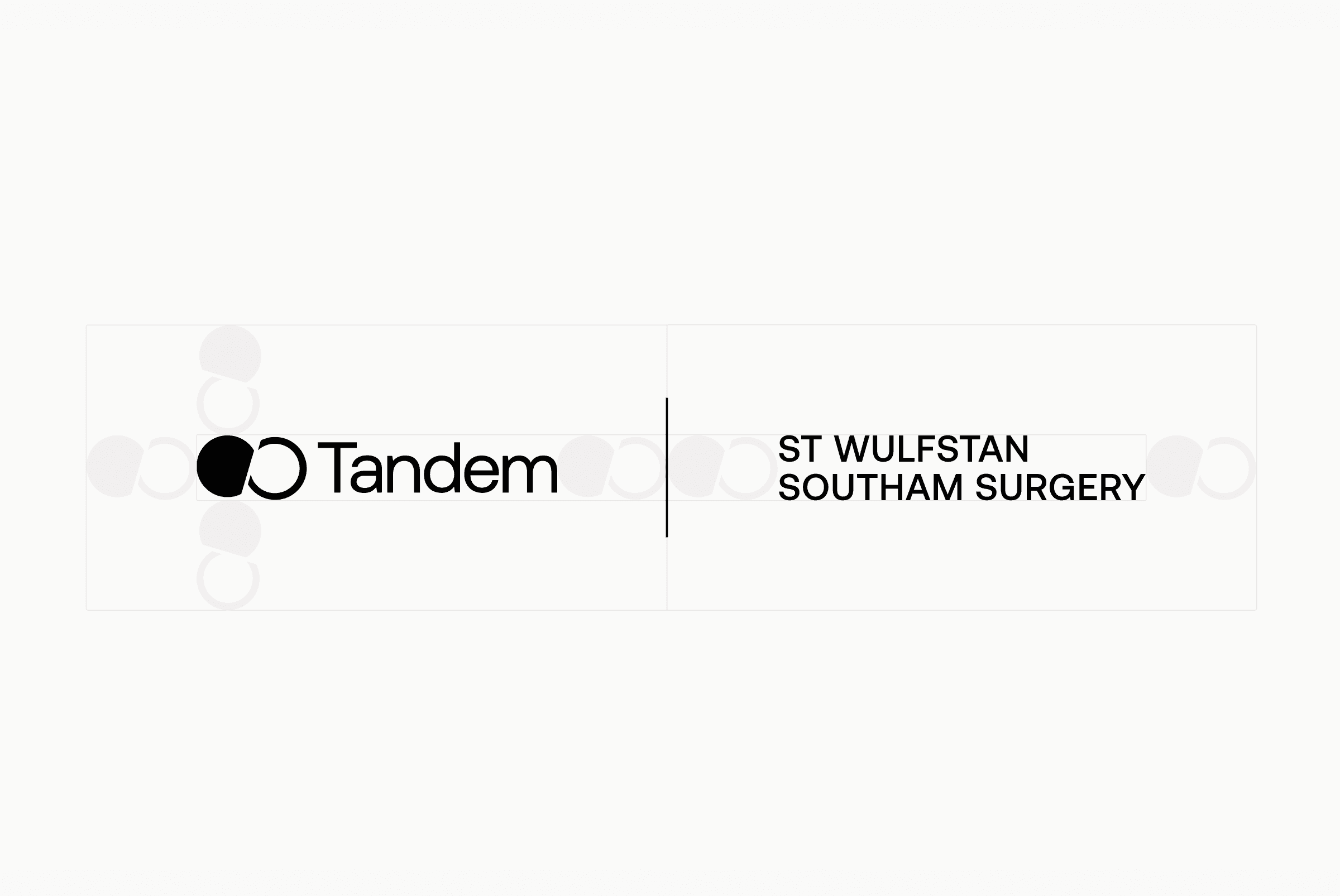
Keep enough space between logos, using the Tandem icon as a guide. The partner logo should usually not exceed Tandem’s height so it does not overshadow ours. Adjustments are fine if needed for balance. In the Recoletas example we matched the wordmark height and let their logo mark extend slightly above Tandem’s for a better visual fit.

Logos in the physical world
Print is not a separate identity. The logo behaves the same on paper as it does on screen. Same clear space, same colour rules, same restraint. For wayfinding, we use Die Grotesk. Clarity matters more than brand presence when someone needs to find their way.
Vector logos
" transform="translate(4 4)" width="12px"/></svg>)
Access is open to all Tandem employees by default; for external access, email brand@tandemhealth.ai.


Primary mark
How to use
For almost all applications, we use the main mark: a black or white logo placed over a solid background or on brand imagery. The logo should maintain a minimum margin equal to the width of the icon from all edges. Do not use a version that's stacked. One consistent logo is enough and supports stronger brand recognition.
Secondary mark
How to use
Secondary marks may be used only when the primary mark is too large for a given application. These instances are rare. Their primary role is to act as an icon in its own right, clean and centered on a page or used as a mask. The only regular exception is in social icons, where the secondary mark is acceptable.
Partnerships
Layouted
The two logos sit in opposite corners, equal in weight. Neither leads, because a partnership is two organisations doing real work together. Behind them sits a real moment of care: a consultation in progress, Tandem working quietly in the background where it belongs. The clinician and patient hold the frame. They are the subject, never the software.
Logo mashup
Keep enough space between logos, using the Tandem icon as a guide. The partner logo should usually not exceed Tandem’s height so it does not overshadow ours. Adjustments are fine if needed for balance. In the Recoletas example we matched the wordmark height and let their logo mark extend slightly above Tandem’s for a better visual fit.
Logos in the physical world
Print is not a separate identity. The logo behaves the same on paper as it does on screen. Same clear space, same colour rules, same restraint. For wayfinding, we use Die Grotesk. Clarity matters more than brand presence when someone needs to find their way.
Vector logos
Access is open to all Tandem employees by default; for external access, email brand@tandemhealth.ai.
