Brand
Typography








Brand
Typography
Display type
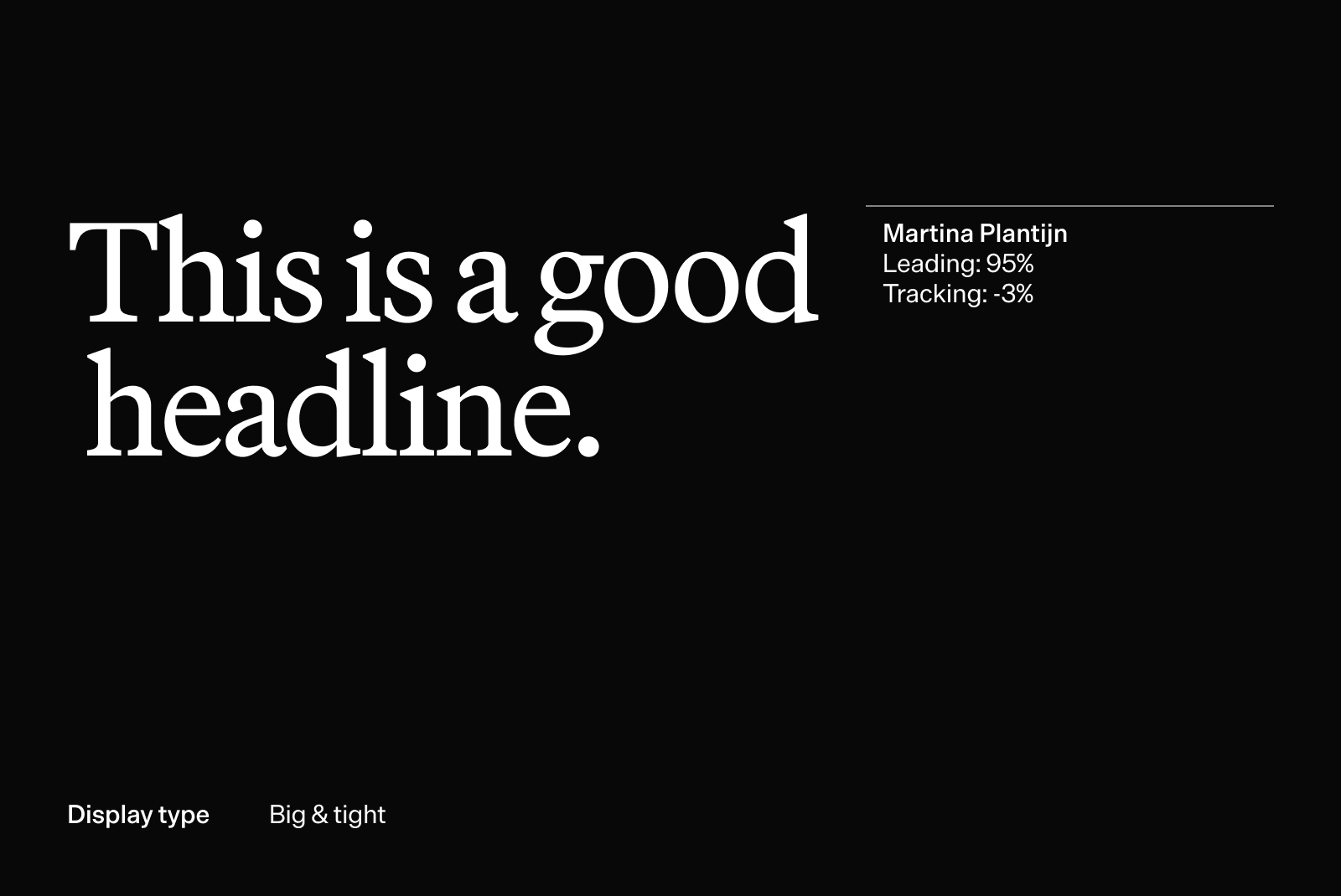
Our main typeface is Martina Plantijn, a serif that brings warmth and humanity to the brand. It is used for big statements, ads, and places where type needs to stand on its own as something iconic and expressive.
Download
" transform="translate(4 4)" width="12px"/></svg>)
Access is open to all Tandem employees by default; for external access, email brand@tandemhealth.ai.


Text type
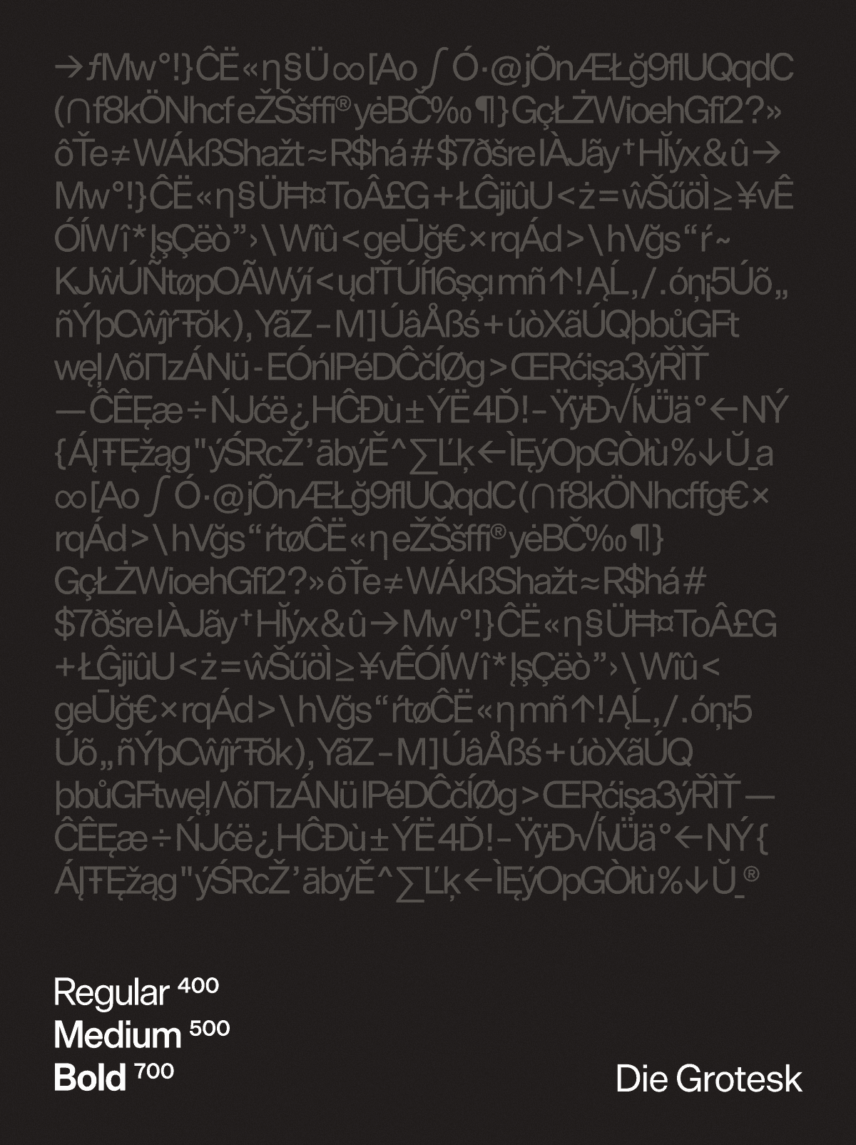
Die Grotesk is our supporting typeface. Designed by Klim Type Foundry, it is a contemporary grotesk rooted in the Swiss tradition, created for clarity, neutrality, and dependable performance across digital and print applications. Die Grotesk is available in three optical variants — A, B, and C — designed for different sizes and use cases. For brand applications, we primarily use variants A and B. When in doubt, use Die Grotesk A.
Die Grotesk is used in Regular, Medium, and Bold weights, providing flexibility while maintaining a restrained, consistent, and highly legible typographic voice across all touch-points.
Download
Access is open to all Tandem employees by default; for external access, email brand@tandemhealth.ai.

Typesetting & Usage
Type is here to be read. Set it so reading is effortless.
Keep strong contrast between copy and background at all times. Use only the weights defined in this system, nothing else. Kern headlines so the spacing feels even and intentional. Give supporting copy generous leading so longer passages stay easy to follow.
Use of color
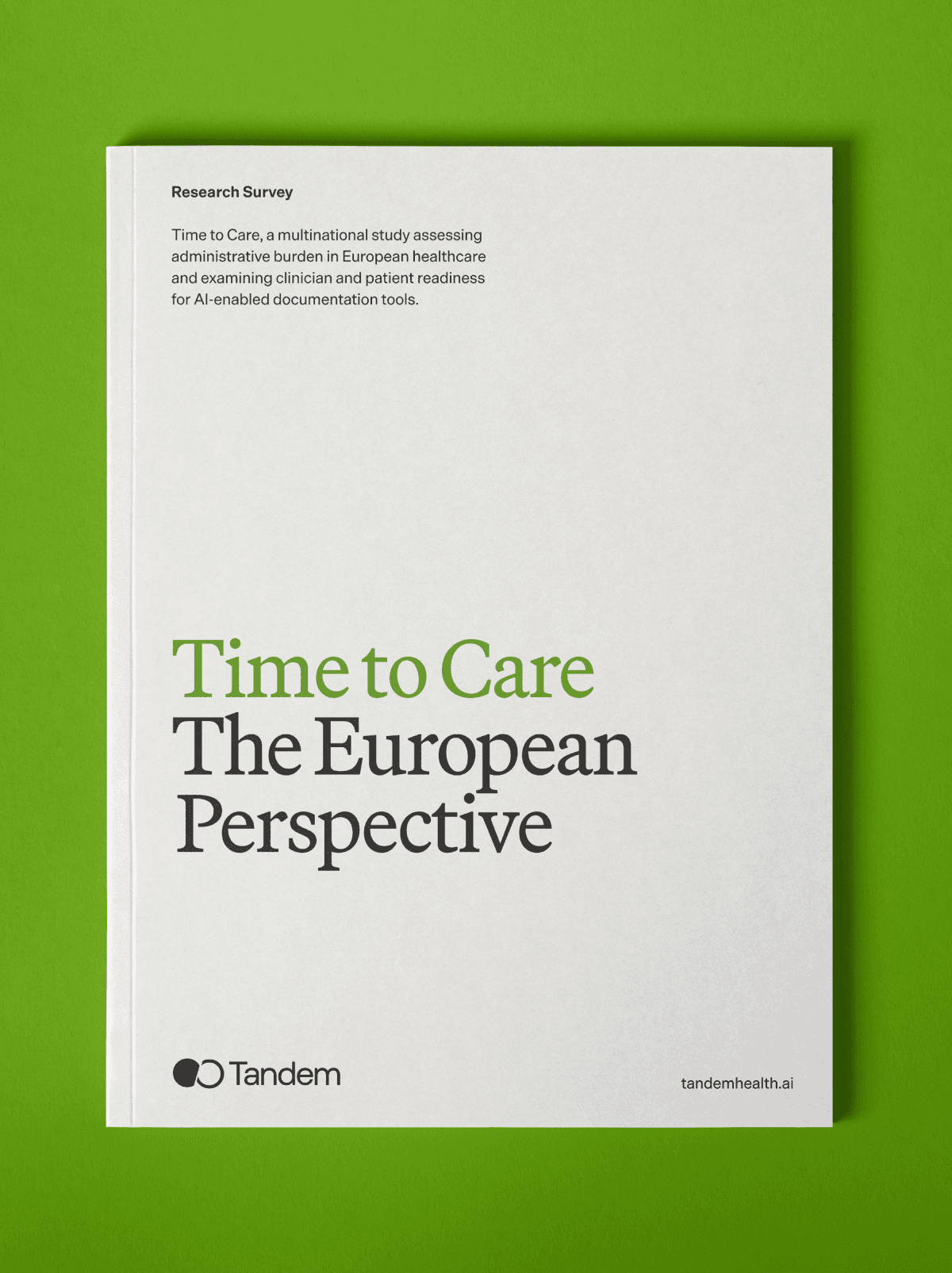
On white or off-white backgrounds, set copy in pitch black. To draw the eye, highlight the most important part of the sentence in Green 500 and set the rest in Gray 800.
On images, always set type in white and highlight the most important part in Green 100. Check contrast carefully every time, the type has to stay legible against whatever sits behind it.


Display type
Our main typeface is Martina Plantijn, a serif that brings warmth and humanity to the brand. It is used for big statements, ads, and places where type needs to stand on its own as something iconic and expressive.
Download
Access is open to all Tandem employees by default; for external access, email brand@tandemhealth.ai.
Text type
Die Grotesk is our supporting typeface. Designed by Klim Type Foundry, it is a contemporary grotesk rooted in the Swiss tradition, created for clarity, neutrality, and dependable performance across digital and print applications. Die Grotesk is available in three optical variants — A, B, and C — designed for different sizes and use cases. For brand applications, we primarily use variants A and B. When in doubt, use Die Grotesk A.
Die Grotesk is used in Regular, Medium, and Bold weights, providing flexibility while maintaining a restrained, consistent, and highly legible typographic voice across all touch-points.
Download
Access is open to all Tandem employees by default; for external access, email brand@tandemhealth.ai.
Typesetting & Usage
Type is here to be read. Set it so reading is effortless.
Keep strong contrast between copy and background at all times. Use only the weights defined in this system, nothing else. Kern headlines so the spacing feels even and intentional. Give supporting copy generous leading so longer passages stay easy to follow.
Use of color
On white or off-white backgrounds, set copy in pitch black. To draw the eye, highlight the most important part of the sentence in Green 500 and set the rest in Gray 800.
On images, always set type in white and highlight the most important part in Green 100. Check contrast carefully every time, the type has to stay legible against whatever sits behind it.

